Pulling Together a Colour Scheme with Teal
Teal, with its distinctive blue-green tone, brings a fresh and modern touch to any interior. This color has become increasingly popular in design trends, making its way into everything from sofas and tiles to wallpapers. Today, I’m going to show you how you can incorporate teal into your décor and explore which colors pair best with it. Read Teal Colour Schemes FAQs and Design Tips
Teal is a combination of blue and green, positioned on the color wheel opposite orange-red. When we think of red and orange, they might seem bold and dramatic. But red is essentially a saturated version of pink, and orange is a deep peach or plaster color. This means that when paired with teal, coral-like shades create a contrasting palette, while blues and greens form a soothing, tonal palette. These two combinations are guaranteed to work, but there are other colors that look great with teal without following a particular rule.
Choosing Complementary Colours for Teal
When selecting complementary colours for teal, it’s important to understand how both contrasting and tonal palettes function. Teal can be paired with neutral tones that enhance its blue-green undertones. If you’re aiming for a bold and dramatic look, contrasting colours like burnt orange or coral are the way to go. These colours sit opposite teal on the colour wheel and highlight each other beautifully.
If you’re after a softer, more harmonious look, then consider a tonal palette. This involves using different shades of teal in your design, such as a saturated teal mixed with softer, muted variations. You can also incorporate analogous tones like olive green as accent colours to create a cohesive and calming effect.
Tonal and Monochromatic Colour Schemes with Teal
If you prefer a more unified look, a tonal palette is the way to go, and you can even experiment with a monochromatic scheme. This involves using similar shades of teal to create a balanced and dramatic effect. By using teal as the primary colour, you can mix its light and dark shades to achieve contrast and depth.
You can further enhance this palette by introducing accent colours with teal to create a dynamic and vibrant look. As I mentioned earlier, olive green is a fantastic addition. It pairs beautifully with teal, adding a touch of liveliness to the design.

Contrasting Brights with Teal
Pairing contrasting bright colours with teal is a popular trend in mid-century modern design. The key here is to find a balance where each colour has its own space, but they all complement each other. Bright, saturated hues like bright yellow, pink, and burnt orange pair wonderfully with teal, creating a bold and energizing combination.
This palette works perfectly with mid-century style prints, like those from Orla Kiely and Scion fabrics. If you’re hesitant about using such bold colours, start by incorporating these bright tones into your design. You’ll notice that they pop even more when paired with neutral counterparts.
Contrasting Muted Colours with Teal
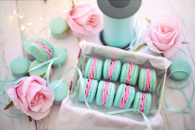
I find that pairing muted colours with teal creates a versatile and sophisticated look. This combination works well for all ages and gives off a timeless feel. Teal blends beautifully with wine-dark burgundy or mustard yellow, offering a sense of vintage French charm or modern Wes Anderson vibes.
In this palette, the combination of muted teal with these tones brings an elegant and serene touch to your interiors. The subdued tones highlight the teal, making your space visually appealing and peaceful.
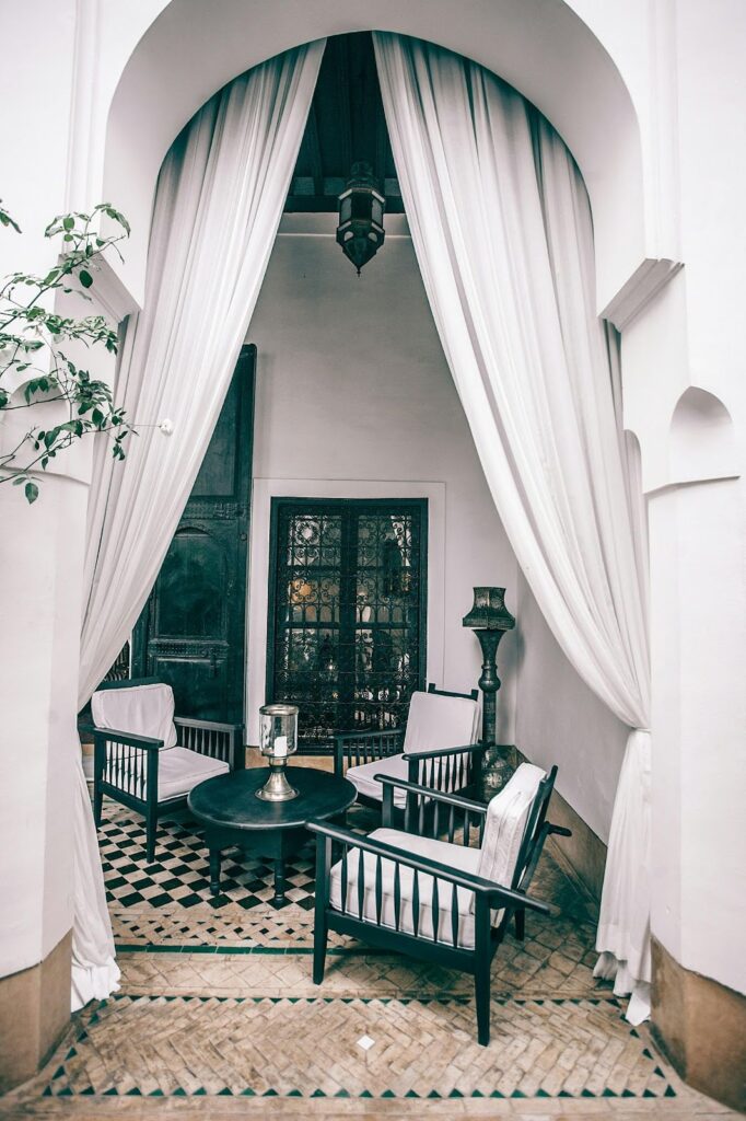
Teal in Interior Design: Practical Applications
If you enjoy the combination of teal with wallpaper and fabrics, this pairing can give your space a bold and modern look. You can even mix patterns, such as floral or geometric designs, to bring out the beauty of teal in your home.
Using patterns with teal adds an artistic flair to your décor. Your space will look stylish and personalized. To make this work, ensure a balance between light and dark tones so that each colour stands out on its own.
Conclusion: Teal as a Versatile and Bold Choice
Teal is a color known for its versatility in design. Whether you choose a tonal palette or opt for contrasting brights, teal always finds its place in any scheme. It can provide your interiors with a bold yet balanced appearance if you use the right complementary colours.
By experimenting with teal, you can give your home a unique and sophisticated vibe.
What is teal, and how is it different from turquoise?
Teal is a beautiful deep blue-green shade, created by blending blue and green with a hint of gray. Unlike turquoise, which is brighter and more vibrant, teal has a richer, more muted vibe that makes it perfect for creating a sophisticated atmosphere in your home.
What colours go best with teal in interior design?
Teal pairs wonderfully with both contrasting colours like burnt orange, coral, and bright yellow, which make a bold statement, as well as tonal colours like olive green and softer variations of teal for a more harmonious, subdued look. You can also balance teal with neutral tones like gray, white, and beige for a chic, modern design.
Can I use teal in a monochromatic colour scheme?
Absolutely! Teal is ideal for a monochromatic colour scheme because you can explore different shades of teal, from deep, saturated tones to lighter, muted versions, while keeping the overall look cohesive. This approach adds depth and personality to your space without feeling overwhelming.
How do I incorporate teal into my home without making it overwhelming?
To keep teal from overpowering a room, try balancing it with lighter shades or neutral tones like white or gray. Use teal as an accent colour in smaller décor pieces like cushions, throws, or rugs, and incorporate natural elements to soften its boldness.
What is the best way to use teal in a small room?
In smaller rooms, you can use teal for a statement accent wall or in smaller furniture pieces, like chairs, pillows, or side tables. Pair it with lighter shades like whites, light grays, or soft neutrals to prevent the room from feeling cramped or too dark.
Can teal be used in both modern and traditional décor styles?
Yes, teal is incredibly versatile and fits both modern and traditional styles. In modern designs, it pairs beautifully with bright contrasting colours like yellow and orange, while in traditional settings, teal complements muted tones and rich fabrics for a more timeless, elegant look.

Is teal a good colour for a living room?
Teal is an excellent choice for a living room! It adds a touch of elegance and depth. You can use it as the main colour on walls or furniture, or simply as accents in cushions, curtains, or artwork. If you prefer a calming atmosphere, pair teal with soft neutrals; for more energy, combine it with bold, contrasting tones.
How can I use teal in my bedroom décor?
Teal creates a serene and inviting vibe in the bedroom. You can incorporate teal through bed linens, throw pillows, or an accent wall. Pairing it with soft lighting and neutral tones like beige or gray helps create a relaxing sanctuary where you can unwind and feel at peace.
What patterns work well with teal?
Teal is a fantastic choice for patterns! It complements geometric prints or bold stripes in modern spaces. For a more classic or traditional touch, floral prints or damask designs work wonderfully, highlighting teal’s rich, calming undertones.
Can teal be used for accent pieces in a kitchen?
Yes, teal can absolutely be used for accent pieces in the kitchen! It pairs beautifully with modern designs, making it perfect for backsplashes, cabinetry, or small kitchen accessories. A pop of teal can give your kitchen a fresh, vibrant look while keeping it stylish and contemporary.